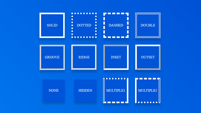
Different types of borders in CSS
Are you front-end developer? And looking Templates For web development? then
this is right place for you. Here you will find pure HTML & CSS examples,
powerful designs, templates and tutorials. In this post we will see how to
create different types of borders.
There are lots of features that are helpful for creating a
coding/programming easily. Choosing the template will save a lots
of time and efforts. So, in this Post we will see
Different types of borders in css and How to create different
types of borders using CSS.
CSS allows you much more options to stylize your site and improve
your web design. Using three CSS properties border-width,
border-style and border-color which respectively control the
width, style and color of the borders. Borders can be used for any
UI design like buttons, cards, input texts, images, etc. CSS
borders are very easy to apply with any component.
Let's see different types of borders:
The CSS language offers you a wide selection of properties to
decorate your elements with borders.
Here are the properties it can take:
- solid : a single solid line.
- dotted : a dotted line.
- dashed : a dashed line.
- double : a double solid line.
- groove : a grooved line.
- ridge : a ridged line.
- inset : a 3D inset line.
- outset : a 3D outset line.
- none : no border (default).
- hidden : no border.
We can also create multiple borders using multiple properties as
shown in image.
To get this code simply copy code from snippet or download from the
link given below. With this code, you can easily customise your
website with less typing.
HTML<!DOCTYPE html><html lang="en"><head><meta charset="UTF-8"><title>Different types of borders in CSS</title><link rel="stylesheet" href="./style.css"></head><body><!-- partial:index.partial.html --><div class="container"><div class="box solid">SOLID</div><div class="box dotted">DOTTED</div><div class="box dashed">DASHED</div><div class="box double">DOUBLE</div><div class="box groove">GROOVE</div><div class="box ridge">RIDGE</div><div class="box inset">INSET</div><div class="box outset">OUTSET</div><div class="box none">NONE</div><div class="box hidden">HIDDEN</div><div class="box multiple1">MULTIPLE1</div><div class="box multiple2">MULTIPLE2</div></div><!-- partial --></body></html>
CSShtml,body {margin: 0;padding: 0;background-image: linear-gradient(45deg, #007ef4, #0049cf);width: 100vw;height: 100vh;display: flex;justify-content: center;align-items: center;}.container {width: 600px;margin: auto;display: flex;flex-wrap: wrap;align-items: center;justify-content: center;}.box {width: 100px;height: 100px;background: #0054d7;color: white;display: flex;align-items: center;justify-content: center;border: solid 7px white;margin: 15px;box-shadow: 0 10px 10px rgb(0 0 0 / 20%);cursor: pointer;transition: all 0.3s;}/*Borders CSS for different Style*/.solid {border-style: solid;}.dotted {border-style: dotted;}.dashed {border-style: dashed;}.double {border-style: double;}.groove {border-style: groove;}.ridge {border-style: ridge;}.inset {border-style: inset;}.outset {border-style: outset;}.none {border-style: none;}.hidden {border-style: hidden;}.multiple1 {border-style: dotted solid dashed double;}.multiple2 {border-style: dashed double dotted solid;}
Conclusion:
That’s It. Now we can create any type of border or multipl borders in
CSS. If you have any doubt or want to give any suggestions, please feel
free to comment down below.
Thanks For Visiting...


Post a Comment