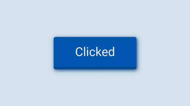
HTML CSS Button Click Effect
Are you front-end developer?
and looking for something new in web development? then this is right
place for you. Here you will find pure HTML & CSS examples,
powerful designs,templates and tutorials. Today we will see how to
create amazing button click effect.
There are lots of features that are helpful for creating a
coding/programming easily. Choosing the template will save a lot of time
and efforts. So, in this Post I will show you HTML CSS Button Click Effect
| How to create HTML CSS Button animation effect for your website
using HTML & CSS only.
To create a button effect, in HTML/CSS, there are only three states
to make your button alive...
- : hover which is triggered by having your cursor over the button.
- : focus which is triggered when you give focus to the button using your keyboard or by clicking it. For some browsers, the focus is given when you press your mouse button down. For others, it’s when you release it.
- : active which is triggered from the moment you press your mouse button down to when you release it.
Applying different colors,shadows,sizes and changing position with
those 3 states you can make your website interface cool and alive.
To get this code simply copy code from snippet or download from the
link given below. With this code, you can easily customise your website
with less typing.
HTML<!DOCTYPE html><html lang="en"><head><meta charset="UTF-8"><title>Button Click Effect</title><link rel="stylesheet" href="https://cdnjs.cloudflare.com/ajax/libs/normalize/5.0.0/normalize.min.css"><link rel="stylesheet" href="./style.css"></head><body><!-- partial:index.partial.html --><button>Click here</button><!-- partial --></body></html>
CSSbody {margin: 0;background: #d3e1ec;height: 100vh;display: -ms-flexbox;display: box;display: flex;-o-box-pack: center;justify-content: center;-o-box-align: center;align-items: center;}button {background-color: #0057ab;color:#EFEFF5;border: 0;outline: 0;padding: 1.3rem 3.5rem;font-size: 2rem;user-select: none;box-shadow: 0px 15px 25px -5px #00478D;transition: all 0.2s;cursor: pointer;border-radius: 5px;border-bottom: 6px solid #00478D;}button:hover {box-shadow: 0px 15px 25px -5px #00478D;opacity: 0.8;}button:active {box-shadow: 2px 3px 9px 0px #0f477d;transform: scale(0.99);opacity: 1;}
Conclusion:
That’s It. Now we have successfully created Pure Button Click Effect in
HTML & CSS. If you have any doubt or want any code, then feel free to
comment down below.
Thanks For Visiting, Keep Visiting...


This is for change billionnaire dreams by interim.But we are going to vote who can fix it
ReplyDeletePost a Comment